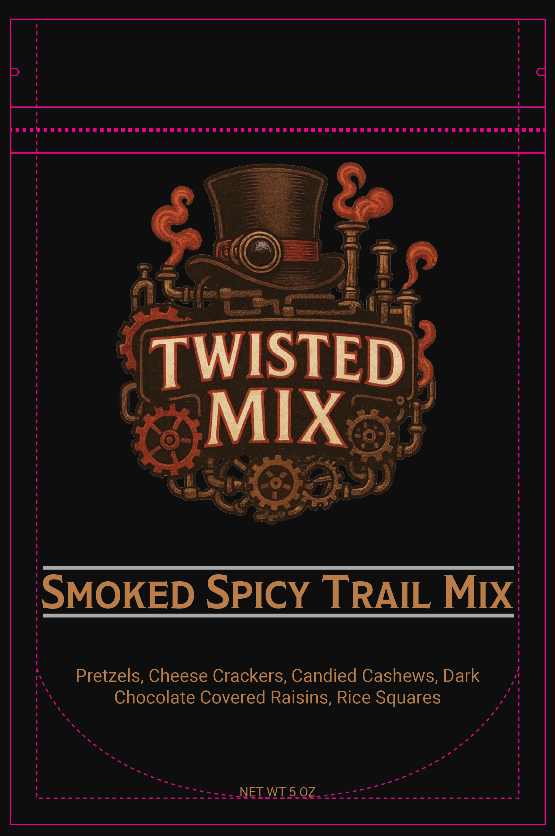
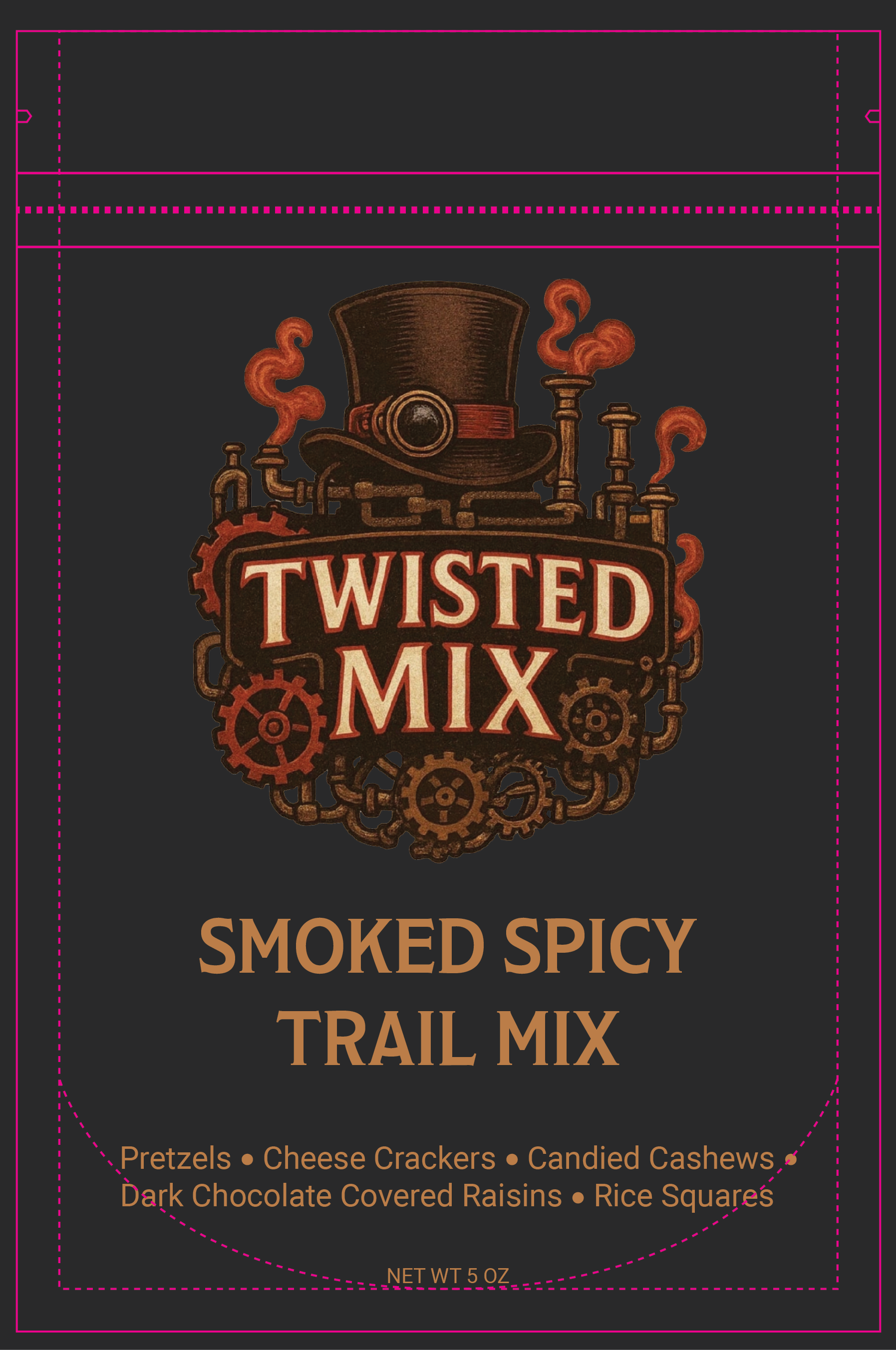
Twisted Mix: Process Materials
Problem
Twisted Mix is a newly established snack brand launching its first product, but it lacked the foundational branding and marketing materials needed to stand out. With no established color palette, typography, or cohesive visual identity, the brand struggled to communicate a bold, premium bar-snack feel.
Solution
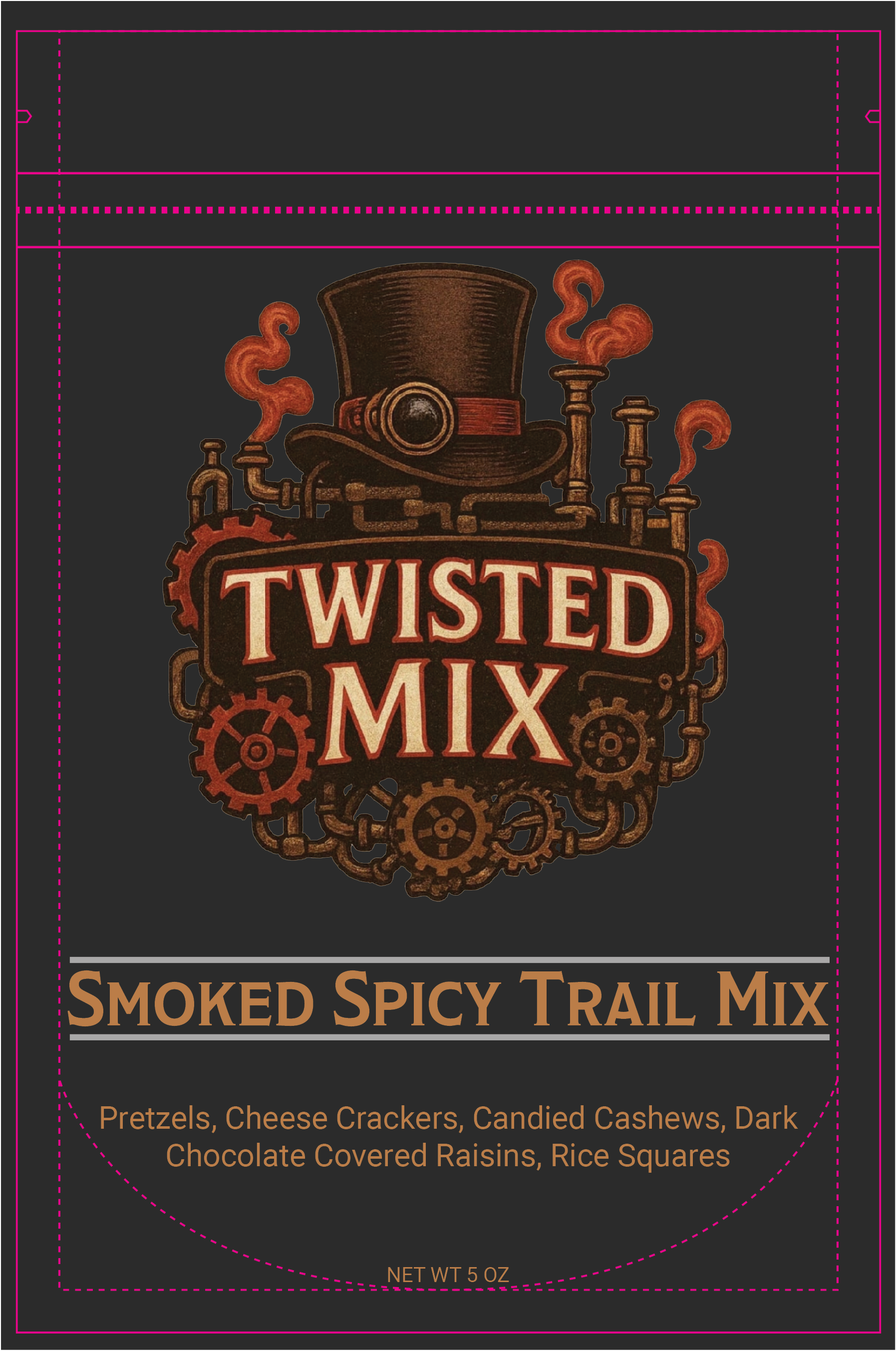
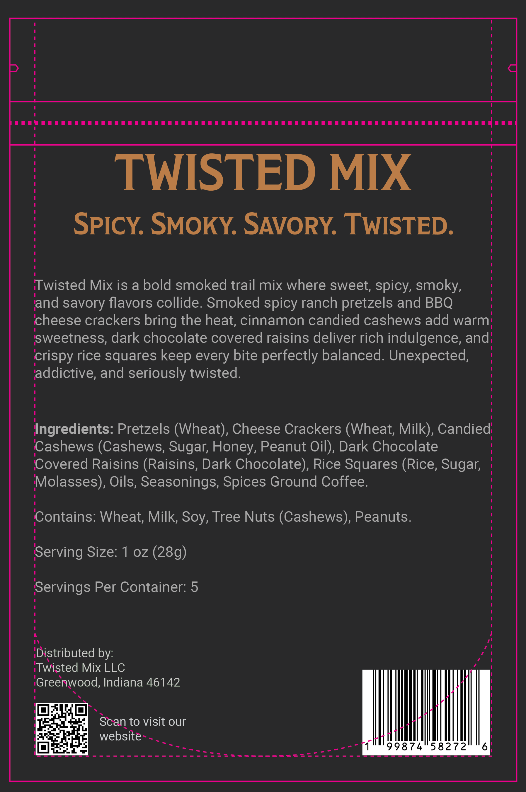
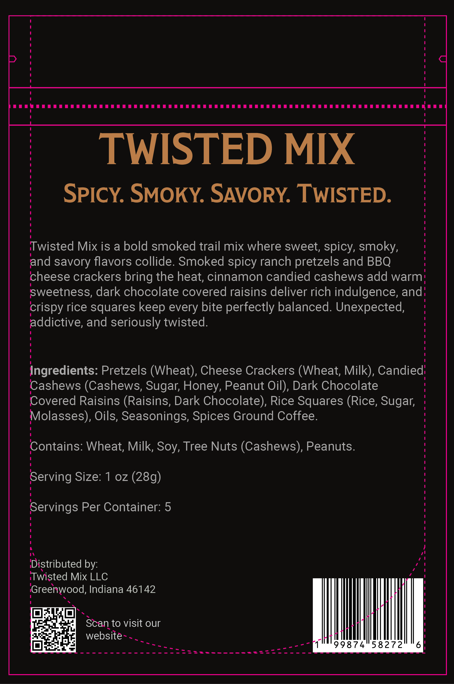
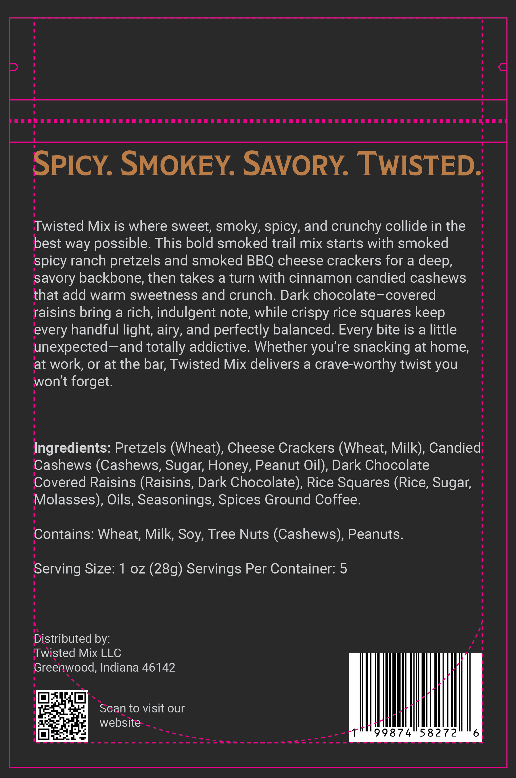
I created a bold, industrial-inspired package design supported by a cohesive color palette and typography system tailored to their target audience. This visual identity elevates the brand perception, strengthens market presence, and provides the foundation Twisted Mix needs to increase visibility and drive early sales.
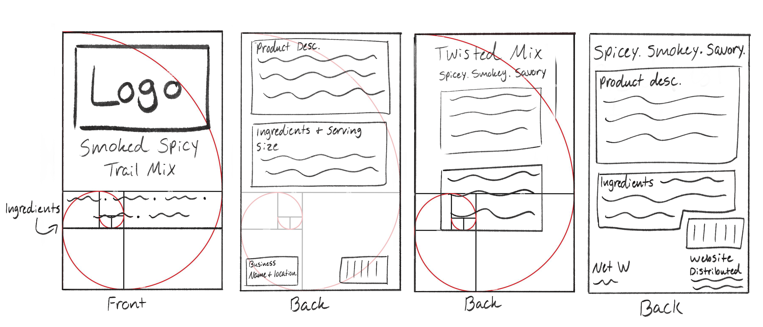
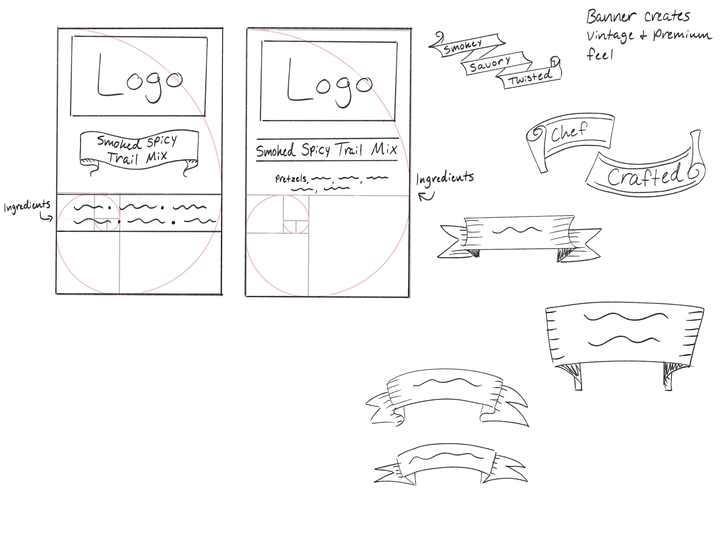
Process
Research ➜ Sketches ➜ Color Palette Selection ➜ Typography Selection ➜ Layout Exploration ➜ Final Package Design ➜ Mockups